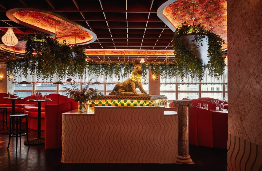
Brooklyn studio GRT Architects has designed an Italian restaurant in New York City where a visual cacophony of colour, pattern and materials combine for a maximalist aesthetic.
Bad Roman is the latest venture from the hospitality group Quality Branded, for which GRT Architects previously completed the interiors for Michelin-starred Don Angie.

Serving a “contemporary and whimsical” take on Italian cuisine, Bad Roman is located on the third level of a shopping centre in the Time Warner Center on Columbus Circle, at the southwest corner of Central Park.
“Where The Shops at Columbus Circle are politely elegant, Bad Roman is a riot of rich and varied materials, textures, found objects, shapes and colour,” said GRT Architects.
The 6,500-square-foot (604-square-metre) space has an open layout so that diners can enjoy the view of the park through the glass facade.
To set the tone, guests are greeted by a sculpture of a boar, which is raised on a patterned podium and wears an illuminated collar.
A curved bar sits in the middle of the restaurant. A light box above is clad in stripes of marble, mirror and cast glass, and emits a soft glow onto the marble bar counter below.
Throughout the restaurant, a variety of booth seating arrangements are designed to accommodate parties of all sizes.
The booths have fabric-wrapped cushioned backs with multiple panels at stepped heights, which form waves when placed side-by-side around the tables.
“We made these islands into worlds unto themselves, incorporating textured plaster cladding, assemblages of found objects and segmented upholstery in a family of orange fabrics,” said the studio.
At one end of the 160-foot-long (49-metre) space are a pair of private dining rooms, while a fully glazed area is located at the other – each with a distinct design language.
Greenery spills from planters suspended from the coffered ceilings, and several different types of lighting help to set the mood.
The bright dining room is contrasted by dark and moody bathrooms, where a two-tiered, classical-style garden fountain sits on a mosaic basin at their entrance.
“Minimal it is not, but the design of Bad Roman is unified by a high level of handcraft, and a say-yes-to-all-beautiful-materials attitude,” GRT Architects said.
“Locally blown-glass light fixtures, trompe l’oeil mosaics, 19th-century fragments and intricate tilework all collude to create an exuberant home for Bad Roman’s fresh take on modern Italian.”
The studio was founded by Tal Schori and Rustam-Marc Mehta in 2014, and their team has since completed a variety of projects across the US.
Other restaurants in their portfolio include Cucina Alba in New York and Curtis Stone’s Georgie in Dallas.
In the residential sector, GRT Architects recently completed the renovation of an East Village apartment and a house perched above the marshes in Connecticut.
The photography is by Christian Harder.

