


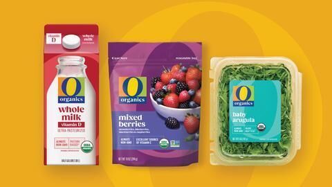
Albertsons has recently unveiled a redesign of its O Organics private brand that includes an updated logo and new-look packaging. The new packaging is designed to stand out, taking a fresh and unexpected approach to marketing an organic brand.
The new design features a sharper logo with a darker blue “O” atop a similarly-colored bar below that reads “Organics” that’s set against a more colorful background. The new packaging is vibrant and colorful, with each product featuring a unique design that highlights the product’s organic ingredients. The new packaging is part of Albertsons’ billion-dollar own-brands club.
Albertsons’ O Organics proprietary brand is being highlighted by rolling out new packaging and designating April as Organic Breakfast Month. The company plans to celebrate the brand’s growth and evolution with vibrant new packaging.
Image Credit: Albertsons, O Organics


