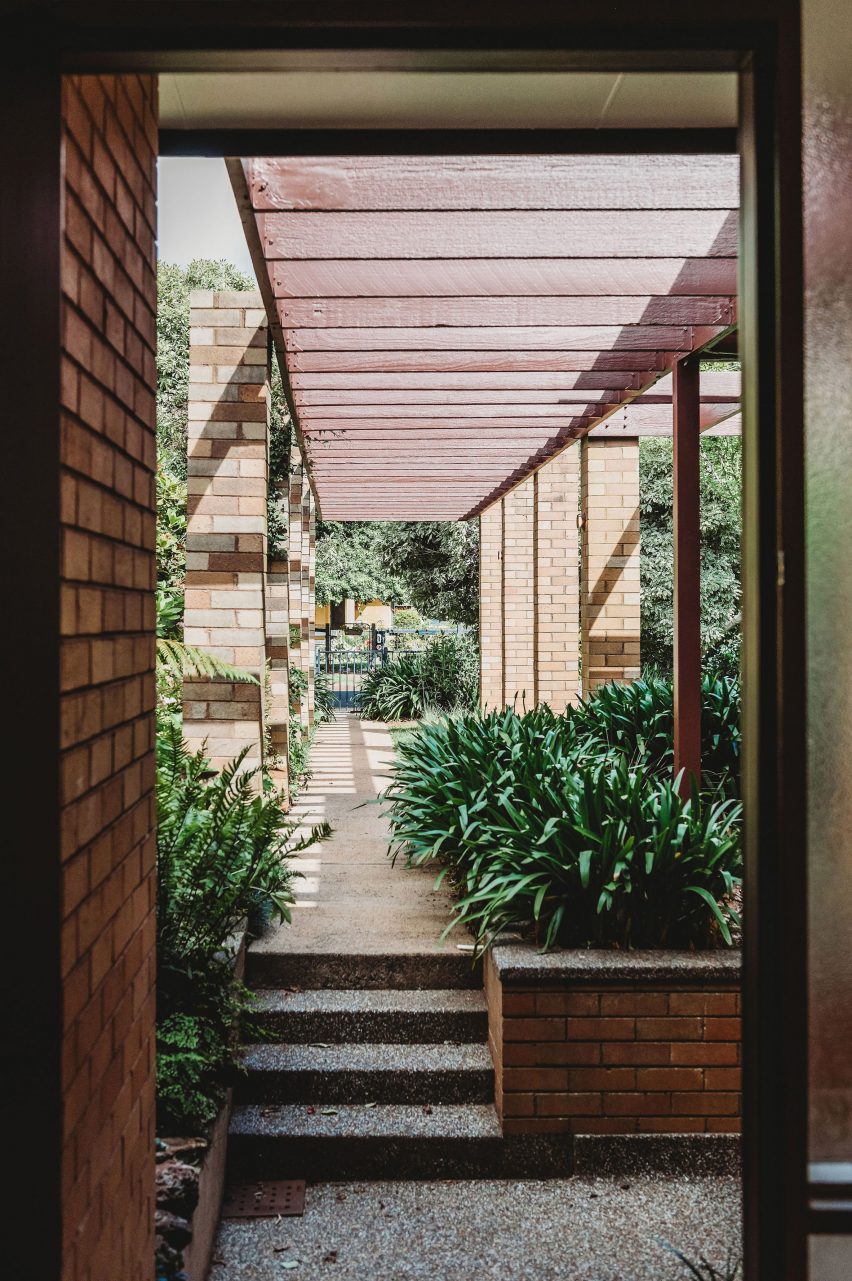
Australian firm PW Architecture Office has revived the fortunes of this mid-century house in Orange, New South Wales, with a sensitive renovation that respects the original building while taking design cues from its material palette.
Park Lane house was originally designed by noted Australian architect Neville Gruzman for the 1962 Carlingford Home Fair before being built in 1964 by construction company Kell & Rigby – known for its work on Sydney’s landmark Grace Building.

When Paddy Williams, founder of PW Architecture Office, discovered that the house was on the market in 2022, the team went to take a look out of architectural curiosity.
The studio was immediately seduced by the sense of flow between the indoor and outdoor spaces of the 1964 house and the quality of the design, construction and materials, despite the fact that it had been through several unsympathetic renovations.
“We loved the sense of arrival created by the pergolas and colonnade that lead you past the garden and pond into the entrance hall,” Williams said.
“Pavilion-style wings separate the shared spaces from the private and we loved the way the pergolas wrap around the house and terraces, framing different spaces in the garden.”
The practice ended up buying and renovating the house as a short-term rental for other modernist architecture lovers.
“We felt a real sense of responsibility to do the project justice and retain the elements of the plan and materials as they were intended,” Williams said.
“We wanted to bring a little excitement back into this mid-century marvel, as it would have had when it was first built.”
Feeling that the floorplan still worked successfully, PW Architecture Office (PWAO) left it unchanged and set out to revive and celebrate the house’s original character while bringing it up to 21st-century living standards.
“We’ve designed it to be a modern take on the mid-century aesthetic, with an immediate sense of relaxation and peace through a refined palette and connection between house and gardens,” Williams told Dezeen.
Removing the worn-out carpets revealed the home’s original Australian cypress floorboards, which were sanded and polished to freshen them up.
Elsewhere, PWAO replaced vinyl flooring with “durable and low-maintenance” micro-cement in the smaller living room, kitchen and some bathrooms.
In the main living room, false ceilings were taken out to expose the original Oregon timber beams, now infilled with hardwood timber and tiled bulkheads.
“When we pulled down the badly damaged plasterboard, the beams were in such great condition and had a beautiful texture so we decided to keep them on show,” Williams said.
“This also allowed us to increase the height of the ceiling and play with the scale and rhythm of the beams.”
In the panelled entrance hall, the original native blackbean timber needed only a little care to restore its rich varied tones, also seen on the doors throughout the house.
Elsewhere PWAO used acacia as a feature timber for panelling and detailing across headboards, stair treads and integrated shelving.
“We’ve used these acacia elements in a playful pattern,” the studio said. “They’re in an ongoing conversation with the original blackbean timber used around the house.”
In the larger living space, a double-sided fireplace helps to zone the living and dining areas, while the walls were clad in textural wood wool panels – a composite made from recycled timber fibres.
“It is actually a thermal and acoustic panel, typically used for ceilings,” Williams said. “We thought it was a fabulous opportunity to provide texture on the walls.”
Throughout the house, terracotta tiles add to the sense of warm earthiness established through the material palette.
“The mosaic tiles were influenced by the original terracotta tiles in the entrance foyer,” the architect explained. “The smaller grids we’ve used are in contrast to the larger original terrace tiles, as well as the grid of the house itself, creating a play on scale.”
When the wiring was replaced, PWAO also had the opportunity to integrate the house with smart home technology, allowing the lights, heating, fans and irrigation to be controlled via an app, balancing modernist aesthetics with modern convenience.
Dezeen recently rounded up eight other mid-century home renovations that marry period and contemporary details.
Among them was another 1960s Australian house with interiors updated by local studio Design Theory for a young client and her dog.
The photography is by Monique Lovick.

