OMA’s New York office led by architect Shohei Shigematsu has completed an expansion to Buffalo’s AKG Art Museum that features a promenade encased in a glass facade.
Architecture studio OMA added the Jeffrey E Gundlach Building to the complex of buildings that make up Buffalo’s AKG Art Museum – an institution that lies on a park designed by American landscape architect Frederick Law Olmsted in the northern part of the city.

The studio expanded the programming of the current museum while leaving openings to better connect the park to the city, noting that the existing configuration of buildings “command a clear separation” from the park.
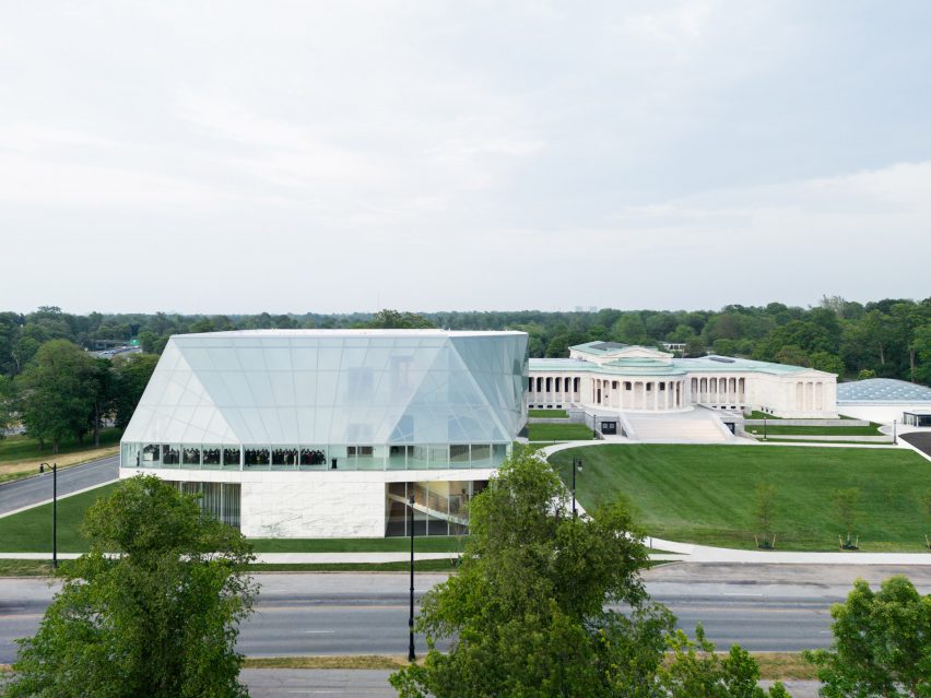
OMA’s structure is adjacent to but separate from the existing structures – a 1905 neo-classical building by American architect Edward B Green and a 1962 modernist expansion by Gordon Bunshaft, both of which were also renovated by OMA.
The extension’s massing is in the shape of a”plus sign”, which the studio said denoted the addition of the building to the complex, and the primary structural material for the building is steel.
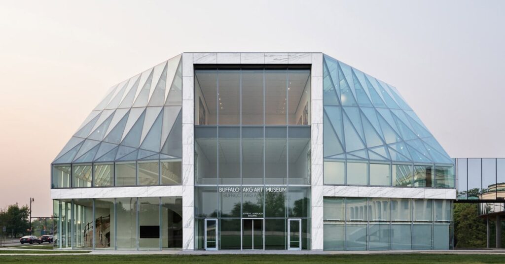
This plus sign-shaped structure was highlighted on the facade with a cladding of White Vermont Danby Montclair marble, which creates a connection of the neo-classical building.
The marble cladding outlines the main concourse of galleries in the centre of the structure, a series of stacked boxes.
Wrapped around this steel and marble central structure is an expressive glass facade made from 540 panels that creates lines of sight through the structure to the park and reveals a promenade that wraps around the second storey of the three-storey museum.
“The promenade and stack of efficient galleries are enveloped by a transparent facade that achieves an open and ephemeral quality,” said OMA.
“This ‘veil’ covers the promenade to form a double-height buffer zone between nature and art.”
Most of the 55,200 square-foot (5,128 square metre) structure’s galleries lie in the centre, while the perimeter is left open for circulation through the promenades.
The first floor of the structure holds five galleries, with a variety of offices, theatres and circulation points arranged around the four corners. The floors are of pink terrazzo in the lobby and transition to stone chip throughout the other areas.
A long spiral staircase sits adjacent to the entrance and circulates museum visitors around a large structural column through the different levels of the structure.
The second storey holds the promenade, which is large enough to hold large-scale sculptures, with another gallery space in the enclosed core that extends up from the ground floor.
This level also has access to a winding, glass-clad bridge that connects the building to its neo-classical neighbour and provides expansive views of Delaware Park.
The top floor holds the single largest gallery, an expansive space with 16-foot-tall (4.8 metres) ceilings. The studio noted that this space has only two permanent structural columns, which are “both mirrored and cruciform”.
Parking for the structure was placed underground to not interfere with the landscaping that connects the three structures.
The renovation of the existing structures included a new roof for the 1905 building. The 1962 structure was given a new entrance that connects it to the park and its central courtyard, which was open-air, has been enclosed by a massive glass installation by artists Olafur Eliasson and Sebastian Behmann of Studio Other Spaces.
OMA has completed a number of additions to historic buildings in the United States, most recently adding a glass-box pavilion to the top of jewellery company Tiffany & Co.’s historic Manhattan flagship.
Other galleries recently completed by the studio, which was founded in 1975 by Dutch architect Rem Koolhaas, include the Tapei Performing Arts Center.
The photography is by Marco Cappelletti.
Project credits:
Partner: Shohei Shigematsu
Project Architect: Lawrence Siu, Paxton Sheldahl
Team: Gregory Serweta, Thomas Holzmann, Maxime Leclerc, Laura Baird, Patricio Fernandez, Napat Kiat-Arpadej,
Bartosz Kobylakiewicz, Claudia da Costa, Jesse Catalano, Tamara Jamil, Camille Bongard, Remy Bertin, Joanne
Chen, Federico Pompignoli, Jackie Woon Bae, Jan Casimir, Brian Tabolt, Daeho Lee, Philippe Audemard d’Alancon,
Yashar Ghasemkhani, Regan Dyer
Competition team: Laura Baird, Lawrence Siu, Jason Long, Daeho Lee, Maxime Leclerc, Ceren Bingol, Nicholas Solakian, Wesley Ho
Executive architect: Cooper Robertson
Landscape architect: Michael Van Valkenburgh Associates
Structure: Arup
MEPFP: Buro Happold
Civil: Wendel
Facade & waterproofing: Thornton Thomasetti
Exterior lighting: Arup
Museum lighting: Litelab
AVIT: Buro Happold
Code: Paul Battaglia
Historic preservation: Preservation Studios
Acoustics: Jaffe Holden
VT: Van Deusen & Associates
Specification writer: The Friday Group LLC
Cost: Cost Plus
Geotech: McMahon & Mann Consulting Engineers
Parking: Philip Habib & Associates
Graphic design: Wkshps with Once-Future Office
Town Square Roof, Common Sky: Studio Other Spaces – Olafur Eliasson and Sebastian Behmann

