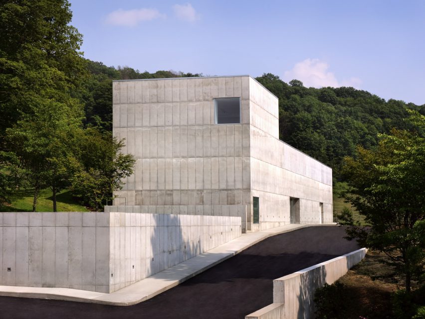
Spanish architects Alberto Campo Baeza and Miguel Quismondo have collaborated to create the Robert Olnick Pavilion for the Magazzino Italian Art museum in Cold Spring, New York.
The concrete-clad pavilion is the second structure on the campus of the museum, which is dedicated to promoting Italian art and design in the United States.
Quismondo, who designed the first building on the site, worked with Baeza to expand the gallery capabilities of the institution.

The pavilion is partially submerged into a sloping green hill, with entrances on either side of the building at the top and bottom of the grade.
It has a monolithic concrete facade with little detail, punctuated at points by simple square windows. At the top of the hill, the structure has a vertical element that gives the whole building an L shape.
Within this space a double-height gallery was conceived of as an isotropic room that is a “perfect cube”, according to the architects. Windows were placed at each corner to create a sundial effect when light from outside enters.
“We built the Robert Olnick Pavilion like a poem: a white cube traversed by light,” said Baeza.
“The main space will embody the beauty of the artwork it exhibits, and with an isotropic design that carves an opening into every corner, each detail will be touched by magnificent sunlight.”
“Not unlike the excitement of birth, it is with great anticipation that we deliver this second building to the museum.”
The building has two floors and a mezzanine, with a long first floor that stretches the length of the structure and holds a variety of programming spaces, terminating at a glass end wall that overlooks a sunken courtyard.
The primary floor holds the two main galleries, one in the long end of the building and another housed in the double-space element created by the vertical element at the top of the grade.
“The pavilion has a humble layout that highlights industrial materials such as concrete to facilitate a conceptually strong and aesthetically neutral environment to compliment the postwar and contemporary Italian art and design it will exhibit,” said the museum.
Between the two gallery spaces is a mezzanine level that is accessed from the door at the top of the slope. This space holds a cafe with a seating area that extends outdoors.
All the interiors are stark white, in line with the minimalism of the facade. Polished concrete flooring and seamless overhead lights were designed to add to the smoothness of the interior.
The museum plans to launch its first exhibitions in the fall, featuring the work of Italian designers and artists such as painter Mario Schifano and architect Carlo Scarpa.
Baeza and Quasimondo has been working with museum founders Nancy Olnick and Giorgio Spanu for more than twenty years, and designed the pair’s home, which was Baeza’s first US project, in 2003.
Other projects by Baeza include a sports complex in Madrid designed to be a “box of light” and a white-walled minimalist house in Monterrey, Mexico.
The photography is by Marco Anelli.

