Sapid Studio aimed to keep as much of the original fit-out as possible during this renovation project, which saw the Swiss design firm turn one burger restaurant in Geneva, Switzerland, into the home of another.
The new burger joint, named Sando after the Japanese word for sandwich, is located near the waterfront in Rive Gauche and serves burgers infused with Japanese flavours such as teriyaki tamago and miso bacon.

Since the space was originally designed for a similar establishment, Sapid Studio made no changes to the layout.
Instead, founders Cecile-Diama Samb and Michael Piderit took a retrofit-first approach inspired by the Japanese craft of boro, which involves repeatedly mending and stitching together textiles to create a multi-layered patchwork.
In this spirit, the studio retained the interior’s original bar – simply re-finishing it in brushed and corrugated stainless steel – and patched up the existing tiled flooring.
The millwork of the previous restaurant was dismantled and repurposed to form wainscoting and a table-height counter running along the window front, designed to resemble those found in Japanese ramen shops.
“All efforts were made to make the most impactful change to the space while minimising the amount of wasted material,” Sapid Studio co-founders Cecile-Diama Samb and Michael Piderit told Dezeen.
“It is the re-working of an existing element, stitched together with surgical demolition, alterations and additions, that creates the unique patchwork that is Sando.”
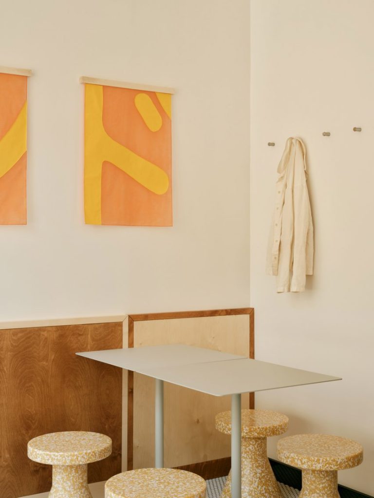
Most literally, the boro technique is reflected in the tapestries that hang in rows from the walls and ceilings, made from reclaimed textiles by local upcycling workshop Lundi Piscine.
Stitched onto a translucent open-weave tarlatan backing, these feature fragments of bright yellow letters that spell out Sando in both English and Japanese.
Birchwood is featured liberally throughout the interior and was finished in three different stains for contrast, as seen in the bar stools that line up along the steel-clad counter to form a subtle gradient.
The two lighter stains were also used to create a colour-block effect across the wall panelling and the window counter. Here, diners can sit on aluminium stools by Danish brand Frama that were chosen to match the brushed metal counter.
Another seating area at the back of the space sees simple off-white metal tables paired with speckled stools made from recycled plastic by Normann Copenhagen.
Apart from the tapestries, the only other wall decoration is provided by several bespoke prints from Swiss illustrator Kristell Silva Tancun, depicting classic Japanese art motifs remixed with burgers, fries and fast food items.
Other well-designed burger joints include PNY Citadium in Paris, which has a sunset-hued interior informed by the roadside diners of America’s West Coast, and Noma’s burger spinoff POPL in Copenhagen.
The photography is by Alicia Dubuis.

